As the name of the CSS Text Shadow property says, you can use this property to add shadow to your text.
You can add a vertical and horizontal shadow to the text. Also, you can add color to the shadow, or you can also blur the shadow.
Basically, we are providing 4 values to it. The first one is the offset-x, which tells the horizontal distance of the shadow from the text, whereas the next one, offset-y, tells the vertical distance of the shadow.
The third value that you would give is for specifying the blur radius. It is an optional thing. The bigger the blur radius, the more blur would be the shadow, which means that the shadow is wider and lighter. Finally, the fourth value is the color of the shadow. It can be given either before or after the offset values.
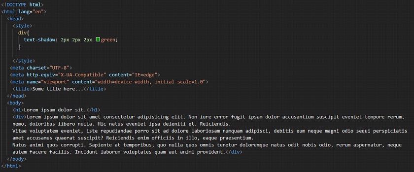
You can refer to the following code to understand the concept of the text-shadow property.
Output –
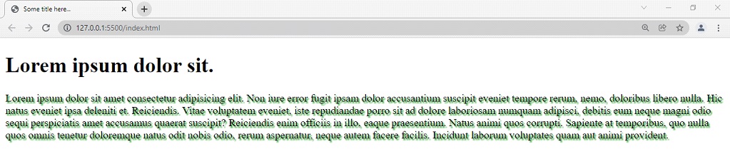
As you can see, the text now has got a shadow. If you are required to give shadow to your text, you can just make use of the text-shadow property.