CSS Animation
As the name suggests, we can perform animations on HTML elements, without even knowing about any JavaScript. Here, we are going to witness two components, the styles which describe the animations, and the keyframes, which indicate the different states of animation.
Now, let’s see the animations in action.
First of all, understand that when we are going to have some animation, we are going to name it, and make corresponding keyframe at-rules accordingly. Also, we have to specify the duration of the animation.
We are going to come across many different properties related to the concept of animations. Let’s explore many of them one by one –
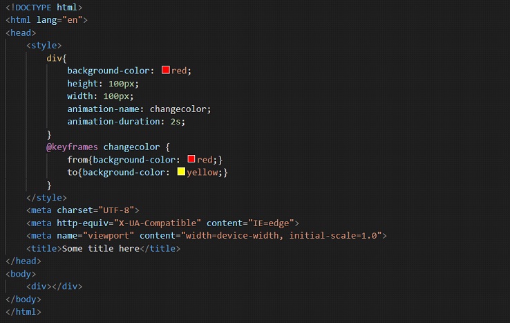
let’s say, we are making an animation, where, there is one div, which initially has a red color, and we want to change its color gradually to yellow. Well, we can do this, with help of animation. Let’s see how –
First of all, we have to get familiar with some properties related to the animations, that we are going to use in the below example, and in some other examples which are on the way ahead. These properties are –
- animation-name
- animation-duration
- animation-delay
- animation-direction
- animation-iteration-count
- animation-fill-mode
- animation
Well, let’s now have a look at the example that we were talking about previously.
Here, you can see that we have a keyframe at-rule. Where we are just setting the different states of the animation. You can also do something like this –
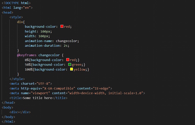
This was just to tell you that we can do something like this. We are still going to stick to the previous example for now.
Notice that we are giving some names to animation, using the animation-name property.
So, the animation-name property is used to specify the name of the keyframe at-rule. Notice that below, we have written the keyframe at-rule, with the same name.
Also, we are declaring the duration of the animation, which means how long is it going to take for the animation to complete one cycle. We did this using the property animation duration.
Notice that we have given a duration of 2s.
If you try to open the previous file in the browser, you will find that the color of the div changes from red to yellow. But this is happening only once, and also after completing the animation, it is coming back to where it was, but within a blink of an eye. Also, the animation is running only once.
So, we are having some properties related to the animation, which we are going to use further, to fix these things.
The next property that we are going to discuss is called animation delay. As you might have got from the name, we are going to specify the delay between the loading of the element, and the beginning of the animation. In short, we are specifying, after how much time should the animation begin, once the element is loaded.
Let’s now modify the code that we have been discussing, and add some delay to the animation now.
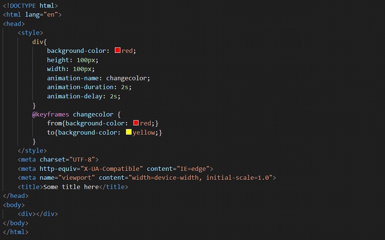
Now, if you try to open the file in the browser, you will find a 2 seconds delay at the beginning of the animation. You can try manipulating the value and play with these properties a little bit so that we can understand how they work.
Now, the problem is that the animation is running only once, that is, for only one cycle. But we are having the freedom to specify the count, for how many times we want the animation to repeat. We are going to achieve this with the help of animation-iteration-count. Have a look at the below program –
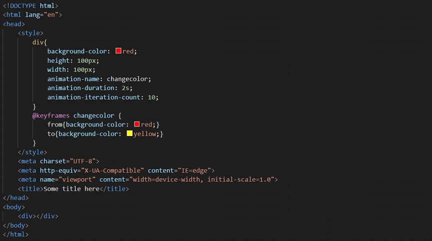
If you try to open the above file in the browser, you will find that the animation now repeats 10 times. You can specify these as per your requirement. If you want the animation to repeat forever, you can just put the value as infinite there, instead of some other value, and your animation will run forever.
So, we can have an animation repeating indefinitely. It is interesting!! But now, there is one problem. If you write infinite there and try opening the file into the browser, you will find that the animation repeats, but again starts over, meaning that it starts again from where it was initially.
If we want to get rid of that, we can make use of the animation-direction property, through which, we are going to specify the direction of the animation.
We can have some values for this property, like normal, reverse, and alternate. You can get an idea from the names of the values as well, about what is going to happen. Well, in the previous program, if we add this property, with the value of alternate, we are going to find that now, we do not experience any start over.
The animation now repeats alternate. Have a look at the code, and try to follow along and open it in your browser, so that you can observe the changes here.
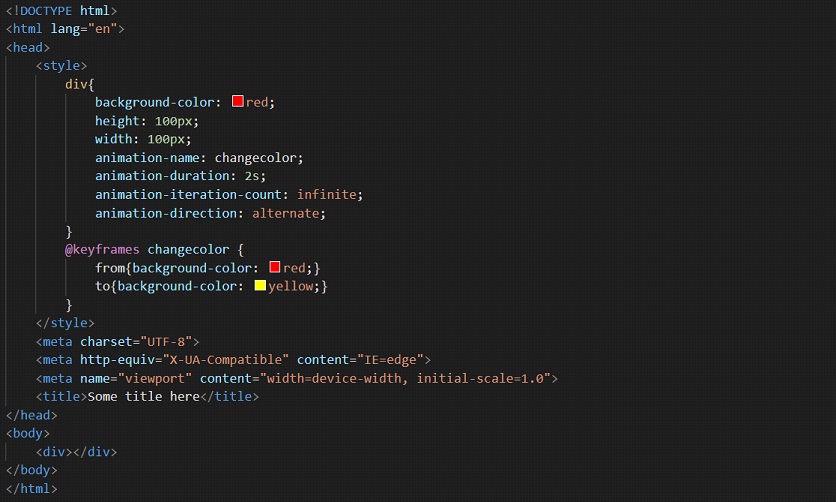
Now, you can find that we have made the animation much better.
Let’s now consider one more property, which is the animation-fill-mode, with which, we are going to determine what values are applied by the animation before and after it executes. To simply explain this, again let’s just consider the previous example. But just one change, we are going to temporarily forget about the animation iteration count, which we have talked about previously.
Now, we had previously observed, that after the animation had finished, it just came back to where it had started. If we want it to retain the after-animation state, we can do it, using the animation-fill-mode property. Let’s have a look at the below code-
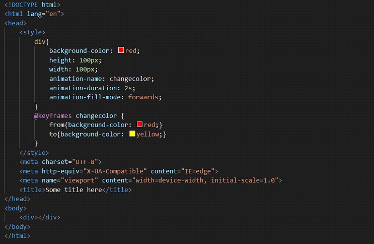
Now, we can see that after the animation has finished, the after animation state is retained, instead of coming back to the start state. If you are confused about this, you can try removing the animation-fill-mode property from the above code, and again observe the output. You will find that after the animation ends, it is back to the initial state.
Now, let’s have a look at the shorthand property for the animation, which is animation. This is a shorthand property for all the properties of animation, including the above discussed. Have a look at the example below, to get a clear idea of what we are doing –
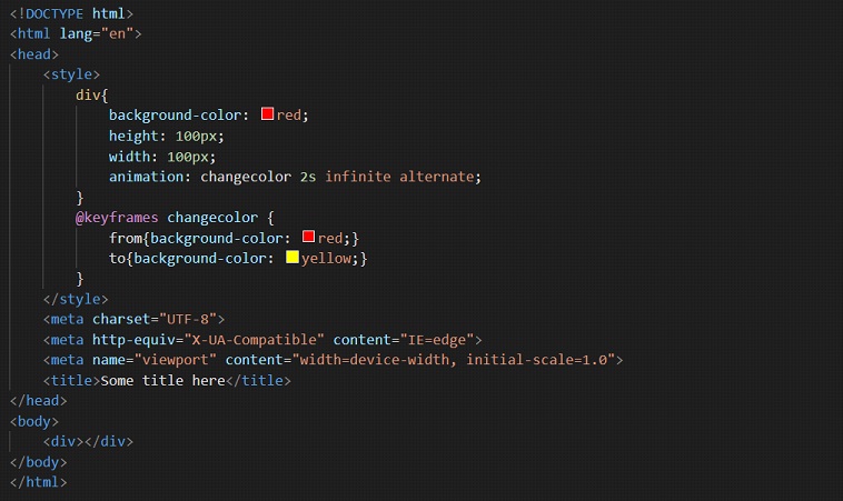
So, we were successful in applying properties like animation-name, animation-duration, animation-iteration-count, and animation-direction in the above example. You can also try playing with some other properties, so as to get a clear picture of the concept of animation.