CSS Transform Property
With transform property we can do different transformations to our element, like moving, rotating, scaling, and skewing some element. This is often useful for our web pages in a variety of ways.
We are first going to observe some 2D transformations and then will move on to some 3D transformations. So, as values for the transform property, we got some functions, which are discussed below.
Here is the list of some functions that we are going to have a look on –
- rotate()
- translate()
- scale()
- scaleX()
- scaleY()
- skew()
- skewX()
- skewY()
Now let’s have a look at these methods one by one.
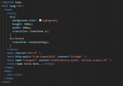
The rotate() method ->
As the name says it all, the rotate method is going to help us rotate the element around a 2D plane. It takes value in degrees and helps us rotate the element.
Have a look at the below example. In this example, we are just rotating the div on hover. I have put some transitions as well so that we can see the transformation happen.
As you can see, when we hover over the div now, it is rotated by the given amount. You can try following along, and opening the file in the browser, to see the output.
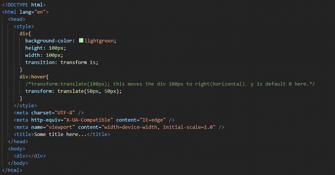
The translate() method ->
With this method, we can move the element. We have to just give the new X and/or Y parameters. If we are specifying one value only(which can be either length or percentage), then we are providing just the x coordinate(horizontal). The y-coordinate will be by default set to zero.
If we are specifying two values, then we are providing the x coordinate and the y coordinate.
Have a look at the below example. It will make you understand both syntax and the use of the translate method. This method is simply used for moving/repositioning the element in the given directions.
Well, here, we are moving the div to 50px in x-direction and 50px in y-direction. You can also try adding some negative values here too. Remember that if you are providing only one value to the function, then it is the x coordinate(horizontal).
Write this code, follow along, and try opening the file into the browser to have a look at the output. When you hover over the div, it translates.
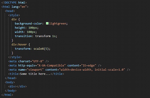
The scaleX() method →
The methods related to the scaling, refer to resizing of elements. Here, we are having a look at resizing the element up or down horizontally, using the scaleX method. We are passing some numbers as a parameter, which is the scaling factor to be applied.
With this method, we can simply manipulate the size of the element. The X in the method name specifies that we are going to manipulate the size of the element horizontally. So here, we are going to increase or decrease the size of some elements horizontally.
Please refer to the below program where we resize the div on hover. Have a look at the example, and follow along. Write the code yourself, and observe the output –
If you try to open the file in the browser and hover over the div, you can find that the element is now being resized horizontally. We have provided 5 as the scaling factor here. You can try centering the div, or placing it somewhere else, so as to have better visualization of what is happening.
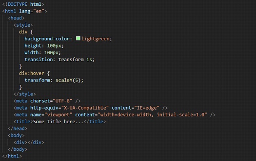
The scaleY() method →
This method is similar to the above one, the scaleX() method. But this time, we are going to resize(up or down) the element vertically(along the y-axis). So, we can increase or decrease the width of some elements. The below program is similar to the previous program, just the difference is that we are manipulating the height of the div this time. In the example, we are providing the scaling factor as 3.
In the example, we can see that when we hover over the div, it resizes in the vertical direction(Y-axis).
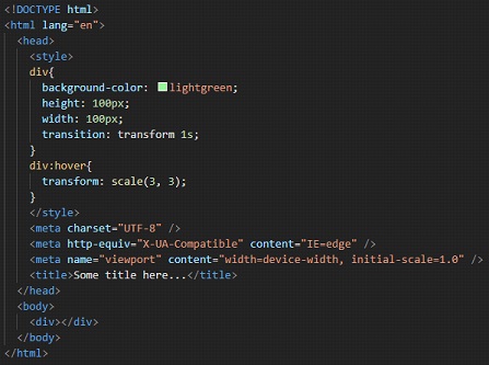
The scale() method →
This method is a combination of the scaleX() and the scaleY() method(discussed above), which means that here, we are going to resize the element both vertically and horizontally(on a 2D plane). Have a look at the below example. Y
ou can try manipulating some values in the function to see some differences. Here, arguments 3 and 3 are just similar to the previous method arguments, which means that the horizontal and vertical resizing will be done accordingly.
So, here we can see that with scale, we are able to resize both horizontally, and vertically. The two values here are for x and y respectively.
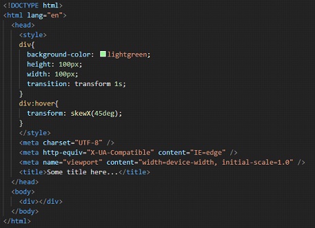
The skewX() method →
With this method, we can skew the element along its X-axis by a certain given angle. You can understand the skew as if we are tilting the element along the X-axis(horizontal axis) (Not exactly though, but just for understanding). Please refer to the below example, which gives a clear idea of the skewX() method.
Try changing the values, and you will get a clearer picture of what is going on. The input to this method is going to be the angle.
If you now try to open the HTML file into the browser, upon hovering over the div, we are able to see that the div is now a little bit tilted, by 45 degrees. You can use it if it is required. Similar to this, we also have a function for the Y direction.
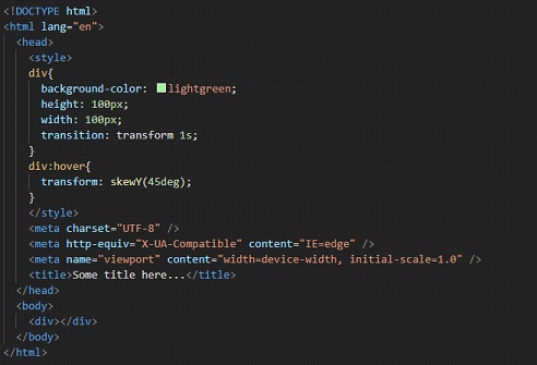
The skewY() method →
This method is similar to the skewX() method, with the difference that this time, the Y here specifies that we are going to skew the element along its Y-axis(vertical axis) by a certain given angle.
This is again the same as we are tilting the element along the Y-axis (again not exactly but just for our understanding). Please refer to the below code and try implementing it for different values, so that you get a clearer picture of the concept.
Observe the output of the given file, trying to open it in the browser. You can observe that when we hover over the div, it is now like tilted a little bit over Y direction.
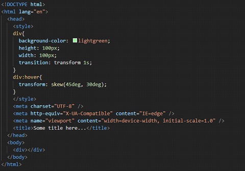
The skew() method →
This method is the combination of the two methods – skewX() and skewY(). Here, we have to give both angles as parameters to the skew() method, and it will do what both the above functions together would do. Please refer to the below program, which is just a combination of the programs seen separately in skewX and skewY functions.
Try implementing the program with some different set of values and observe the difference in the outputs and try to interpret the different outputs so that you have a clearer picture of the concept in your mind.
You can follow along, and observe the output here for the above code.
So, the above discussed were some 2D transformations. Now we are going to see some 3D transformations.
Until now, we were dealing with 2 axes, namely the X-axis and Y-axis, but now we are going to deal with 3, i.e X, Y, and Z. Well, it may not be easy to visualize what is going on in the 3 Dimensions, but still, we will try our best to understand the different things that we can do here.
First of all, we have seen the rotate thing, and we used to rotate our element along the 2D plane. We have separate methods for it as well, like if you want to rotate it in the X direction, or Y direction, or Z direction, or if you want 3D, it is also available. Let’s check the rotate X function first –
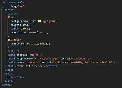
Well, if you try to hover over the div now, it may seem that it is being pressed from top and bottom. But it is not like that. It is being rotated over the X-axis(horizontal axis). We can try the same thing with Y-axis as well –
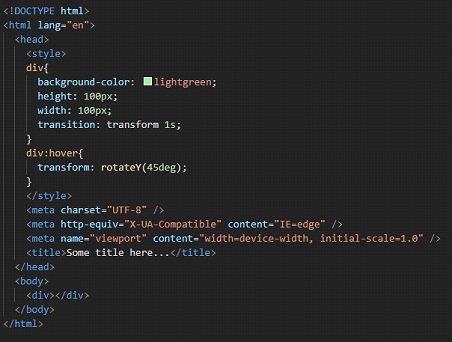
Well, now, when we hover over the div, it may seem that the div is being pressed from left and right, but again it is not like that. The element is being rotated along the Y-axis(vertical axis).
Now, let’s try the rotation with the Z-axis.
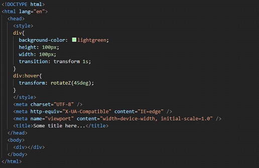
As you can see, upon hovering over the div, we can see that it is rotating along Z-axis.
We have a scaleZ function as well, just like the scaleX and scaleY functions. Here, we are simply scaling the element up or down along the z-axis. Have a look at the below example –
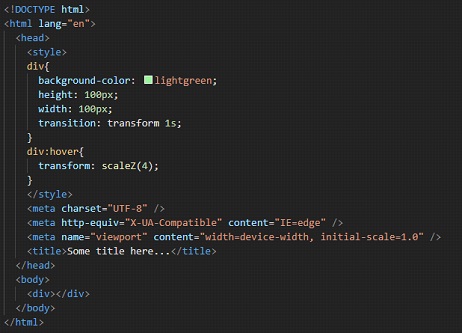
Well, upon hovering over the div, there may not be any effect, since the thing is happening along the z-axis now.
We also have a translateZ function, if we want to reposition the element along the z-axis. Have a look at it –
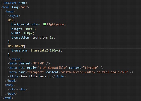
Again, here as well, we may not be able to see any effect upon hovering over the div, since it is again happening on the z-axis.
So, in short, if you are willing to do some 3D transformations, we got some methods to do that as well.