CSS Shadow effect
Well, we have been dealing with the text for a long, but now, we are going to have a look at how can we add some shadow to our text. Well, it appears so nice, as if it has been raised above. Also, we are going to have a look at the box-shadow property, with which, we can add some shadows to the box(usually some drop shadows, so as to make them appear to be raised above).
CSS Shadow
You can add shadow to the text using the text-shadow property. Now let’s have an example so as to understand the text-shadow property –
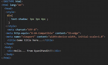
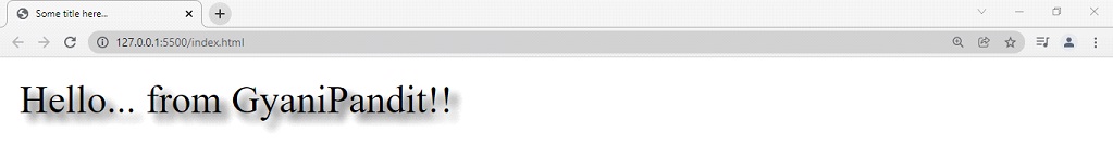
Here, simply I created a div block, with some text in it. If we try opening this file in the browser, we can see that the text has a shadow-
CSS Text Shadow
Here, we have specified the three values. Let’s have a brief discussion about what these values are –
- The first value is the offset-x, which specifies the X distance(horizontal distance).
- The second value is the offset-y, which specifies the Y distance(vertical distance).
- The third value is the blur radius. The more the blur radius, the wider and lighter is the shadow.
As we have discussed in brief earlier, we are going to have a look at the box-shadow property as well, let’s have a look at an example that demonstrates the same –
CSS Box Shadow Examples
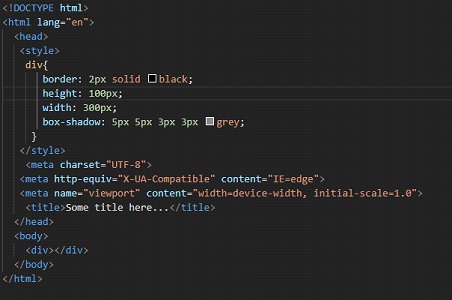
Here, we have just created a div, with no text in it, with some border, having some height and width, and a border shadow as well. You might be wondering what are the four values for this property. Basically, the first value is the offset x, which tells the x distance of the shadow(horizontal distance).
- The second one is the offset y, which tells the y distance of the shadow(vertical distance)
- The third value is the blur radius. The more the blur radius, the shadow becomes bigger and lighter. It is not compulsory. If not declared, it is specified as zero. This will produce a sharp shadow.
- The fourth value is the spread radius. If the value is positive, the shadow will grow bigger, and the negative value will result in a shrinking shadow. If not specified, this value is zero as well.
- The fifth value, you are familiar with, is the color. If not specified, it defaults to the current color.
- There is a keyword that we can add here. It is inset. Actually, the thing is that if we are not specifying this inset keyword, then the shadow appears to be a drop shadow(like a raised box). If we are specifying the inset keyword, it is the opposite of the default one. Specifying the inset keyword will make the shadow depressed(a depressed box). You can try adding the inset keyword and have a look at the changed output.
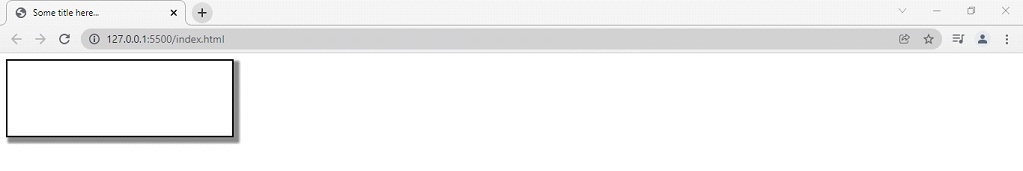
By the way, let’s first have a look at the output of the above code –
You can also try doing the same thing in some states, like the hovering state. You can try experimenting with some other colors and values. As you can see above, I have specified a gray color for the box shadow. You can specify some other color, or even if you do not specify any kind of color, it defaults to the current color.