CSS Responsive Web designing
Earlier, mobile devices were not there. The websites that were being designed at that time, used to be seen with the help of a computer device. But soon after that, mobile devices have begun to come into the picture. But the websites were not made for them, so the browsers would just shrink the website to fit the screen size, which was not good.
This is where the responsive thing comes into the picture. Well, you also might have opened some random websites on different devices, and wondered how the same website looks quite different on different devices.
If you wonder why they are making different websites entirely for different devices? Well, that is not exactly what’s happening. Well, they are just creating a website, and they are creating it as responsive, which means creating web pages that would look good across different devices. It is as if the items are automatically adjusting themselves according to the device the website is being viewed in.
First of all, we have been writing some lines of code right from the beginning, and we did not even think about them. These are some meta elements. There is one meta element, where we are specifying the name attribute, with a value viewport.
Let’s try removing that from our code, and we are going to see what is going to really happen if that line is not in our example. Let’s have a look now.
If we try to open the above file on a mobile or tablet(which can be done easily using the developer tools), you can observe that the website seems to shrink to fit the screen size. Have a look at the output
As you can see, the site appears to shrink to fit the size of the mobile screen. But no one would want that. Well, so we need to bring some responsiveness to our web page, which means that, the elements should be resized according to the screen that they are being viewed.
So, first of all, let’s correct the above thing because it is really not a solution to shrink the webpage to fit the screen size. We need to make it responsive.
Now, let’s add the meta element, through which, we are conveying that the website needs to be responsive or something like that. After we add it, let’s have a look again, at the website. Here is what it looks like now –
Now, let’s again have a look at how it looks when one opens it in the mobile.
Well, just by adding one instruction, the scene has now changed, because the browser was now instructed to do so. Now, we are going to understand something called media queries, which is very interesting. Also, there are some other things that we are going to talk about here. But I just wanted to make you aware that you need to make sure that the above meta tag is there because if it is not there, as we move further, it might cause some problems in responsiveness things.
Now, let’s talk about the media queries. But before we move any forward, there is one simple question for you. How do you identify that a particular device is a mobile phone, tablet, or computer? Well, one obvious answer would be that the mobile is relatively smaller in size than the tablet, and so is the tablet when compared with a computer device.
So, based on the different device widths, there are going to be different devices available. So, we can do the things according to the specified device width. If you are not getting a whole of what I am talking about, you will get the point in a while.
What we are talking about is the device width. Mobile phones have a smaller width, and then the other devices are also there.
So, I can say something like – for the media screen, and the max-width(or min-width) is let’s say 768px, then do these things. We are going to talk about what are these things soon.
Before we move to the example, I want to also tell you about something called breakpoints. Well, the breakpoint is a point at which the content of the web page will be adopting a new layout for a better content view for that particular screen size.
In other words, we can say that the breakpoint is some point, where one screen ends, and another screen starts. For example, when we are talking about a mobile, there are various size ranges in mobile phones as well. So like we can consider that the max-width of some mobile phones can be 576px.
So, in short, we can say that the website content will be reacting depending on some breakpoints.
Since there are various size ranges for different devices, there are no official breakpoints given, but we can decide according to some particular range. But you can follow the bootstrap breakpoints. You can go through them, and we are also going to make use of those bootstrap breakpoints. So, for mobile devices, we are having a max-width of 576px, while for tablets, we have 768px.
Then there are some laptops and desktop things, with some large(>=992px), some extra-large screens(>=1200px).
You will be surely able to understand the thing while we will be considering an example.
First of all, to start with, we just need to do some things. We need to understand what are we going to do. We are going to specify the media types, through which, we are specifying the category of the device. Here are some values that we have for media type specification –
- all → specifications for all devices
- screen → specifications for screens
- print → when we are viewing some document in the print preview mode.
Also, we have to specify something else, called media features, through which we are specifying, what are the features of that particular media. Like if we are specifying the media as a screen, that is a media type.
After this, we are specifying what should be the features of that screen, like what should be the max-width for example. After this, we are done, and we are going to write the normal CSS as we have been doing for a long.
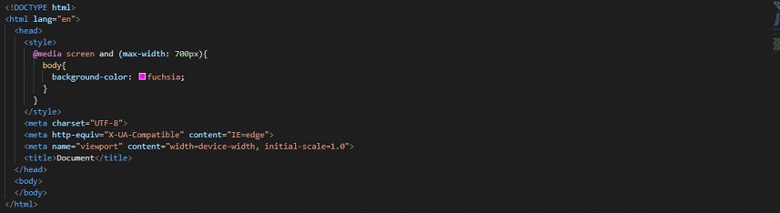
Here is a very very simple example, to understand media queries, and also how are we going to write them.
In the below example, we are giving some color to the body, only at some particular device range. Let’s have a look at how are we going to do that –
So, in the above example, if you try to follow along, and try to open the file in the browser, you can observe the changes. You can try resizing the window, or take the help of the developer tools so that you can observe in a better way.
We find that if the condition is fulfilled, then only the CSS within the media query is being applied, else it is not being applied. So, this is how we could do something on the basis of what device are we viewing on.
Let’s have another example, where we are going to use another media type, which is print. Well, when we are using print, we are saying that when someone is on the print preview mode, this should happen. Now what should happen is our call. Let’s have a look at it too.
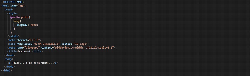
If you try to follow along and try to open the print preview mode, we will be able to see nothing there, since, we have set the display for the body, to none.
Also, you can use another media type, which is all. Please make a note that specifying the media type is optional, and if you are not specifying anything, then it is by default considered as all. We can also combine multiple media queries, using logic, or logic.
Let’s also try this all thing once. We can either write all or even if we write nothing, it is considered as all. So, I am just going to write nothing. Now, let’s have a look at the example –
So, as you can see, we have specified nothing, and then by default, it will be all.
Also, observe that we are writing the same CSS while we are writing the media queries.
Now, for demonstrating the same thing, we are going to have an example, where we will change the background color of the body. By this, I mean that the different devices will have a different background color for the web page. With this example, you will also understand what, and how are we going to make use of media queries, and get to know about the syntax as well. Have a look at the below example now –
Now, have a look at the CSS file –
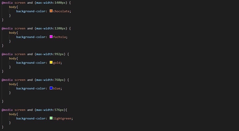
Well, as you can see, we have written different things for different device widths. On a mobile, the background color of the body is going to be light green, whereas, on a tablet, it is going to be blue, and so on. Notice that we have written the queries from bigger devices to smaller devices here.
Also, it is likely that you would write some general CSS too, along with the media queries. So, we should always write the media queries at the bottom of our CSS file.
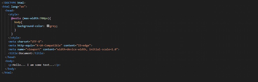
This is because if we try writing some other property after the media query for some element, that we want to be handled differently for some device(for which, we have already written the media query), then the media query won’t work. For example, have a look at this example –
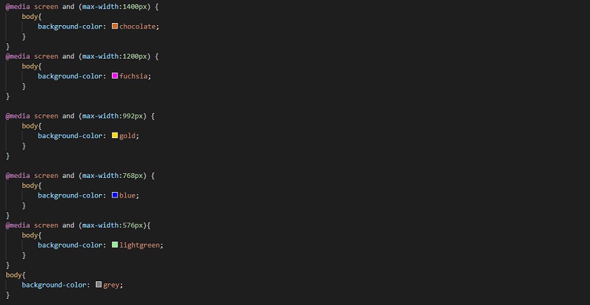
If you try the above example, you will find that the media queries are not working at all, even if we have specified all the things the same as previously, but still, the background color of the body appears to be grey for all devices. This is because these things are applied coming down from the top. So, it sees afterward that the background color of the body is supposed to be grey, and even if earlier, we have specified some media queries, it did what we specified at last. So, make sure that the media queries are written at last.
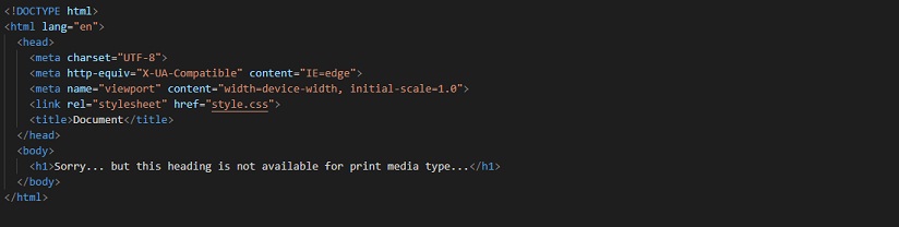
Now, let’s try writing something for print. Let’s say that you have some data, and you don’t want the user to print that data. If this is your requirement, you can do something like this. Have a look at the below example.
Also, let’s have a look at the CSS for the same –
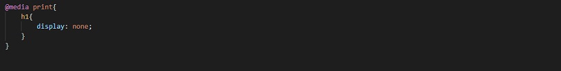
Now, if you have a look into the print preview mode, the text from h1 is not available there, since we have specified that for the print media, the display of the h1 element should be none. You can try these different things and play with them a little bit more, so as to get more clear with the concept.
Now, if you want to specify all, instead of screen or print, you can specify it there as well, or if you do not write anything, it is by default considered as all. Also, the things that we have, like min-width, or max-width, do make sense with their names. These are just some media features that we are going to consider.
Whenever we are going to need to combine multiple queries, we are going to use different logics like ‘and’, ‘or’, ‘not’, ‘only’ as per our requirements.
Now, let’s have a look at another interesting thing, which is orientation. With this, we are able to test for the portrait mode and landscape mode of the device.
Well, portrait mode means when the height of the device is greater than the width, and on the other hand, landscape mode means that the width is greater than the height of the device.
So, let’s say that we want to do something when the device is on landscape mode. Let’s keep it simple to understand(since we are understanding the orientation thing), and let’s make the background color of the body another color when the device is in the landscape mode and different color for the portrait mode as well. Have a look at how are we doing it –
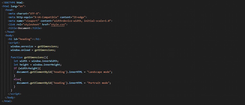
Well, in the above program, you might also be seeing some JavaScript. But if you try to follow along, and write the same/similar code, open the file in the browser, and try to resize the window. You will find that the h1 displays portrait mode and landscape mode, depending on what mode the screen is in. This is not magic, but just logic and event.
Do not worry about what JavaScript we have written, because you can learn and explore JavaScript more later. But here, we are just creating a function, which is to get dimensions, through which, we are going to get the height and width of the content window.
Since when the window resizes, the dimensions are going to change, we have been told to invoke the function on resize and reload as well.
So, this is simple. Now, let’s have a look at the CSS that we have written.
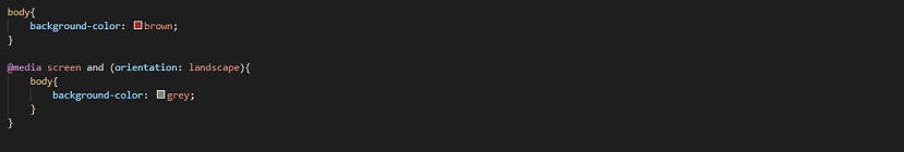
So, as you can see, normally, the background color of the body is going to be brown. But we have a media query, which says that if the media type is the screen, and the orientation is landscape(which means that the device is in the landscape mode), we are going to apply the following CSS, where we have simply written that the background color of the body should be grey.
So, now you can understand that the device has the general background color of brown, but when we turn to the landscape mode, the background color of the body changes to grey. Also, for ease of understanding, I also have given a heading, where, when we are in portrait mode, it displays portrait mode, and when we are in the landscape mode, it displays landscape mode. You can have a look at the output though, and try resizing the screen to see the effective changes.
So, this was about orientation, through which, we are able to test for the portrait mode and the landscape mode, and then apply the styling accordingly.
So, now let’s summarize what we have done so far –
We have written the media queries, which start with a declaration @media. This is a way to tell that hey… this is going to be a media query!
Also, on a basic note, we are having some media type specified(if not, it is considered as all), through which, we are specifying for what media type is this media query for. If we want to combine some media features, we are going to use some logic like and, or, not, only, to specify the things accordingly.
Then, there are going to be certain CSS rules, that we wish to have for that particular thing. In short, we are going to write some CSS into it. That CSS is going to get applied only when the media query turns true. For example, in the above example, we have seen that generally, the background color of the body was brown. But when the media query turned out to be true, which means that when the media type is the screen, and the orientation is landscape, then only the background color was made grey.
Remember that we have some different media types, like –
- screen
- all
Specifying the media type is optional. If we have not specified anything for the media type, then the media type is all.
For media features, you can give some things like width, height, orientation, etc. that we have seen above. For width, and height, we can use the exact things, or also we can go within some range, like giving some max-width or min-width, to test for different width ranges of the devices.
Also, there is another media feature, which is hover. With this, we can test whether or not the user can hover over an element(which essentially means that they are using some pointer device, since you cannot hover over something touchscreen). So, let’s say that we are on some device, on which we can hover over the element, and we are having some CSS. Now, let’s have a look at the example, and then we will understand what is happening.
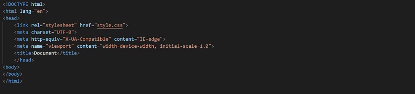
So, in the above example, we have literally done nothing, other than linking the stylesheet. The rest is the boilerplate kind of thing. We are more interested in having a look at the CSS now –
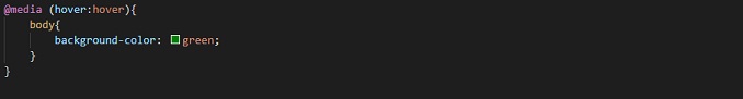
Now, we can understand from the above CSS, that the background color of the body becomes green if our device allows us to hover over some element.
Now, if you have a look at the output on the browser on your PC, the screen actually appears to be green, if you are allowed to hover over some element. Like if you are on a touchscreen mobile device let’s say, you are not allowed to hover over some element.
In such a case, the properties here are not applied there. You can try doing it. For having a look at the mobile phone, you can just choose the mobile phone option from the dev tools in your browser.