CSS List-related properties
Well, at times, we have to make use of the lists on our web pages. We have often seen some markers like circles, squares, or even some number markers, or alphabets or roman numerals too. Now, we are going to look after some properties, through which, we can do different things with the list.
Here are the properties that we are going to look after –
list-style-type
list-style-image
list-style-position
list-style
First of all, let’s consider the list-style-type property. With this property, we are able to specify the type of the list item marker for a list. As specified earlier, we have different markers available, and through this property, we can specify the markers. There are many different values for the list-style-type property, and we are going to see many of them. Let’s have a look at an example, where we are considering both the lists, ordered, as well as unordered.
Here is an example, of the unordered list –
<!DOCTYPE html>
<html lang=”en”>
<head>
<style>
ul{
list-style-type: circle;
}
</style>
<meta charset=”UTF-8″ />
<meta http-equiv=”X-UA-Compatible” content=”IE=edge” />
<meta name=”viewport” content=”width=device-width, initial-scale=1.0″ />
<title>Some heading here…</title>
</head>
<body>
<ul>
<li>list item</li>
<li>list item</li>
<li>list item</li>
<li>list item</li>
<li>list item</li>
</ul>
</body>
</html>
Have a look at the output now –
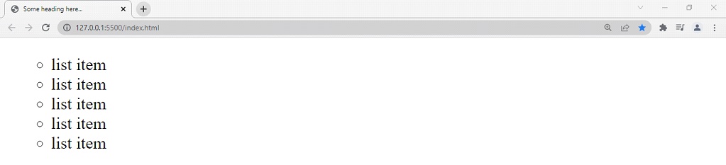
As you can see, we have specified the marker type of the unordered list to circle. There are some other values as well, like square, disc, and many others.
Now, let’s try the same thing with the ordered list. For the ordered list as well, we have got some style types, like decimal, lower-alpha, lower-roman, upper-roman, etc. have a look at the example below –
<!DOCTYPE html>
<html lang=”en”>
<head>
<style>
ol{
list-style-type:lower-alpha;
}
</style>
<meta charset=”UTF-8″ />
<meta http-equiv=”X-UA-Compatible” content=”IE=edge” />
<meta name=”viewport” content=”width=device-width, initial-scale=1.0″ />
<title>Some heading here…</title>
</head>
<body>
<ol>
<li>list item</li>
<li>list item</li>
<li>list item</li>
<li>list item</li>
<li>list item</li>
</ol>
</body>
</html>
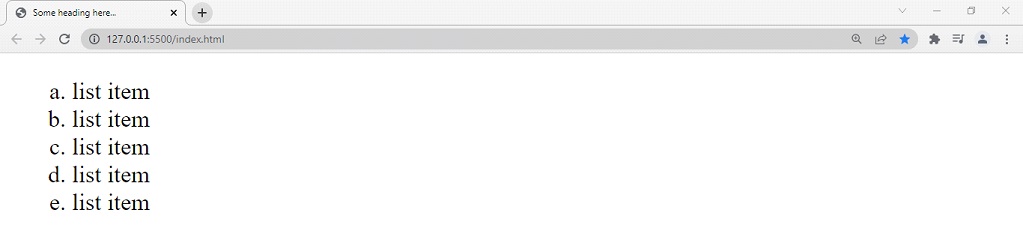
As you can see, we could have the alphabet as markers. We have some other choices as well, like the upper alphabets, roman numerals, etc. So, you can try them as well. Also, if you want no markers for the list items, you can specify none, as a value for the list-style-type property. Have a look at the below example, where we have removed the markers from the unordered list, with the none value.
<!DOCTYPE html>
<html lang=”en”>
<head>
<style>
ul{
list-style-type:none;
}
</style>
<meta charset=”UTF-8″ />
<meta http-equiv=”X-UA-Compatible” content=”IE=edge” />
<meta name=”viewport” content=”width=device-width, initial-scale=1.0″ />
<title>Some heading here…</title>
</head>
<body>
<ul>
<li>list item</li>
<li>list item</li>
<li>list item</li>
<li>list item</li>
<li>list item</li>
</ul>
</body>
</html>
Now let’s have a look at another property, which is list-style-image. With this property, we can specify some images as list item markers. So, whenever you want to specify some image as a marker, you can comfortably use this particular property. Through this, we can also have gradient as our marker(since the gradient is also a special type of image. Don’t worry if you are not familiar with gradient right now, because we are going to see this soon).
First of all, let’s try to add a gradient as a marker for the list items. It is very easy. Since we are going to add a linear gradient here, we are going to use a function called linear-gradient(), and specify some colors. If you are wondering what a linear gradient is, you can consider it as a transition from one color to another color. Have a look at the below example –
<!DOCTYPE html>
<html lang=”en”>
<head>
<style>
ul{
list-style-image: linear-gradient(red, lightgreen);
}
</style>
<meta charset=”UTF-8″ />
<meta http-equiv=”X-UA-Compatible” content=”IE=edge” />
<meta name=”viewport” content=”width=device-width, initial-scale=1.0″ />
<title>Some heading here…</title>
</head>
<body>
<ul>
<li>list item</li>
<li>list item</li>
<li>list item</li>
<li>list item</li>
<li>list item</li>
</ul>
</body>
</html>
Notice that we are using the property list-style-image, to get some image as a marker(gradient in the above case). Also, let’s now add some images as a marker. Have a look at the example –
<!DOCTYPE html>
<html lang=”en”>
<head>
<style>
ul{
list-style-image: url(‘icon.svg’);
}
</style>
<meta charset=”UTF-8″ />
<meta http-equiv=”X-UA-Compatible” content=”IE=edge” />
<meta name=”viewport” content=”width=device-width, initial-scale=1.0″ />
<title>Some heading here…</title>
</head>
<body>
<ul>
<li>list item</li>
<li>list item</li>
<li>list item</li>
<li>list item</li>
<li>list item</li>
</ul>
</body>
</html>
Notice the URL function that we are using here. With it, we are specifying the location of the image that we want there as a marker. This is pretty amazing and easy to understand. Here, we have given some icons there, as a list marker. Lets now have a look at the output –
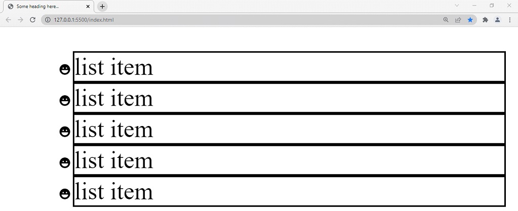
I have zoomed in the browser window a little bit(more), so as to make sure that you can see the changes. Now, we can see that the marker is now an emoji… or the emoji is the new marker… So, if you are required to keep some images as a marker, you can keep them as we have done above.
Now, let’s have a look at another property related to lists, which is list-style-position. With this property, we are able to specify the position of the marker. The property has two values, outside and inside(outside is the default). Well, to understand this in a better way, let’s have an example over here. Also, we are going to do some construction for a better visualization here. We are going to give borders to each list item so that we can see the difference. Have a look at the below example –
<!DOCTYPE html>
<html lang=”en”>
<head>
<style>
ul{
list-style-position: outside; /*this is by default*/
}
li{
border: 1px solid black;
}
</style>
<meta charset=”UTF-8″ />
<meta http-equiv=”X-UA-Compatible” content=”IE=edge” />
<meta name=”viewport” content=”width=device-width, initial-scale=1.0″ />
<title>Some heading here…</title>
</head>
<body>
<ul>
<li>list item</li>
<li>list item</li>
<li>list item</li>
<li>list item</li>
<li>list item</li>
</ul>
</body>
</html>
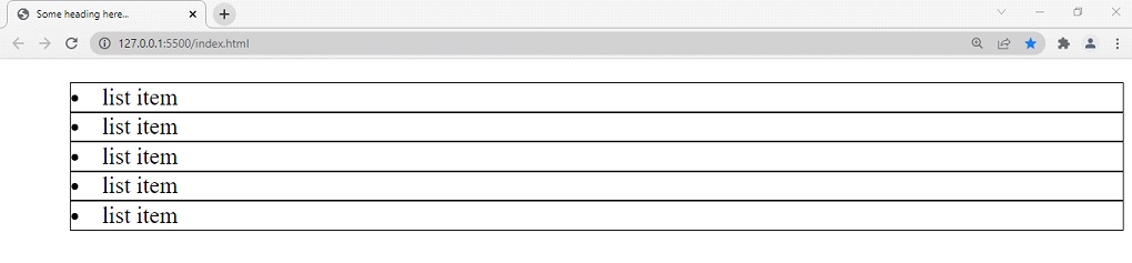
Now, if you try to see the output, it appears to be something like this –
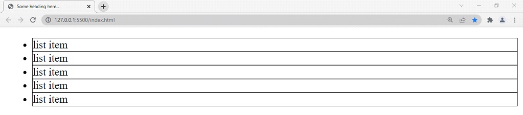
As you can see, the position of the marker is outside the box. This is the default value by the way.
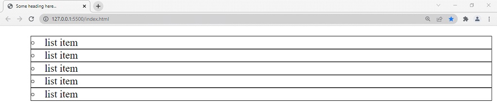
Now, if we change the value of the property to inside, this is how the output looks like –
As you can see, the marker is now inside the box. In short, we can say that the marker is now part of the list item. If you are required to do this, you can make use of the list-style-position property.
Now, let’s have a look at another property, which is a shorthand property, with which, we can specify the values of all the above-discussed list-related properties. This is pretty amazing and handy if you wish to declare everything at once. Here is an example, where we are trying to use the shorthand property list-style –
<!DOCTYPE html>
<html lang=”en”>
<head>
<style>
ul{
list-style: circle inside;
}
li{
border: 1px solid black;
}
</style>
<meta charset=”UTF-8″ />
<meta http-equiv=”X-UA-Compatible” content=”IE=edge” />
<meta name=”viewport” content=”width=device-width, initial-scale=1.0″ />
<title>Some heading here…</title>
</head>
<body>
<ul>
<li>list item</li>
<li>list item</li>
<li>list item</li>
<li>list item</li>
<li>list item</li>
</ul>
</body>
</html>
Now, if we have a look at the output, the property values have been accordingly set. Let’s have a look at the output –
So, this way, we can also style the lists accordingly. You can also try doing different things, and playing with it. You can use this thing as and when required.