Grid layout
While we were dealing with flexbox, we got some power to align things in a better way. But with flexbox, we were working with only one dimension, which means either row or column. To solve this problem, we have another layout, called a grid layout. Now, with a grid layout, we can work in two dimensions, which means that we can work on rows and columns altogether.
With the grid layout, we are allowed to make many complicated layouts pretty easily, just making the use of rows and columns. So, now, let’s get started with the concept and understand how can we work with the layout using the grids.
Now, first of all, there are some terminologies to understand before we dive into the concept.
There is something called a grid container. It is nothing but the container, which is going to contain the grid items. The grid items are simply the grid items. Remember that the direct children of the grid container, become the grid items.
Now, if you are wondering that if we already know about flexbox, why are we learning about grids now? And what should we use – flexbox or grid? Which one is better? You can use both of them. The thing is that both are best in what they do, so you can use them as per our requirements.
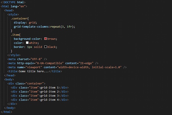
Now, we are going to put a light on how are we going to create a grid container. Simply, for that element, we have to make its display a grid(or inline-grid), and it will become a grid container. All the direct children of the grid container automatically become grid items.
But, this is not the only thing that we have to do. We also have to declare the number of columns and rows that we want to have in our grid layout.
So, essentially, we have to make the element as a grid container, and then we have to declare the number of rows, and columns for our grid. Let’s have a look at how are we going to do that –
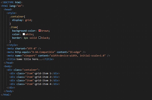
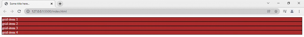
Have a look at the output, and you will notice that nothing has really changed, even if we have set the display of the container class element to grid. Here is the output –
Well, this is why, along with it, we have to also specify the number of columns and rows for the grid layout that we want to have. You might already be familiar with the concept of rows and columns since it is just a general thing. Right now, we are only having one column over here. But we can specify the number of columns, and also how much every column should be.
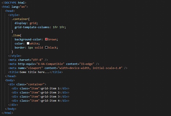
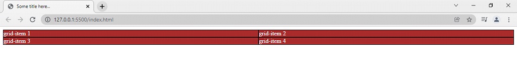
We are going to do it with the property called grid-template-columns. So, let’s say that we want to have 2 columns over here. So, since we have 4 items, the 3rd, and 4th items will just wrap to the next row. This is how are we doing it.

This way, we have declared that we want two columns of 300px 300px. So, if you try to open the file in the browser, we have the output as something like this –
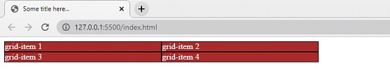
So, as we can clearly see, we have two columns now, each 300px. If the item does not fit into one row, it is wrapped in another way, which is pretty amazing. We can also give the size in percentages.
Also, right now, we are having a fixed size column in the layout. If we want to have our columns take up some part of the available space, we can use something called a fraction. We can define them to take up 1 fraction, or 2 fractions,s, or whatever in the space in the container. This is how we are going to do it –
So, we have said that there are 2 rows, and each row is taking up 1 fraction of the available space in the grid container. Now, the output is something like this –
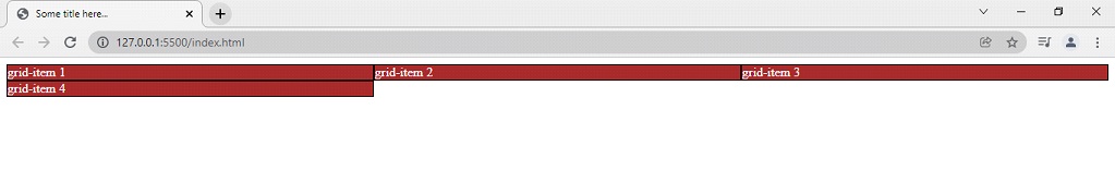
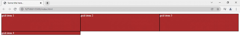
 If you want to have something like this, you can make use of the fraction. Now, another thing is that we are writing for every column, like 1fr 1fr or something. Since we had 2 columns, we did it twice. What if we have 10 columns? Are we going to repeat this 10 times? Just to avoid this, we have a repeat function with us.
We can use this function with the grid-template-columns, and the grid-template rows as well. As some values, we are going to give the count, of how many columns are there(instead of repeating these many times, just specify the number), and how much each column should be.
Let’s have a look at how are we going to do that –
Well, now, we have 3 columns, taking up 1 fraction each, of the grid container. The 4th item will just wrap to the next row now. Let’s have a look at how is it going to look like –
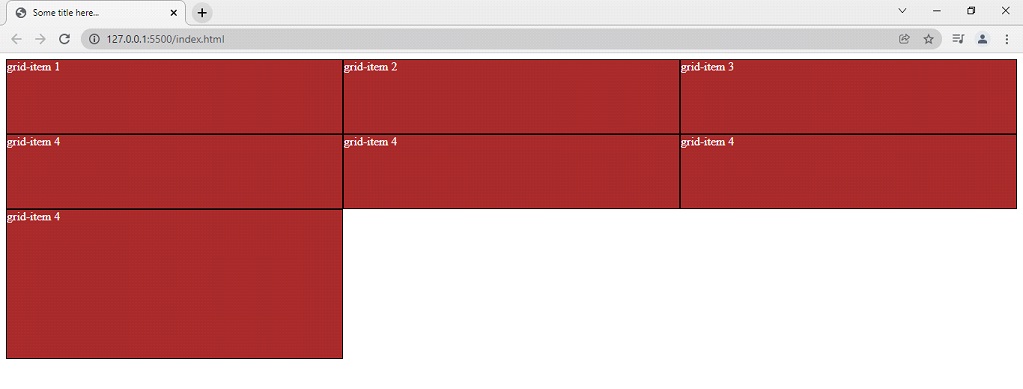
 As the next thing, we are going to look upon another property, which is grid-template-rows. Here is how we are going to do this –
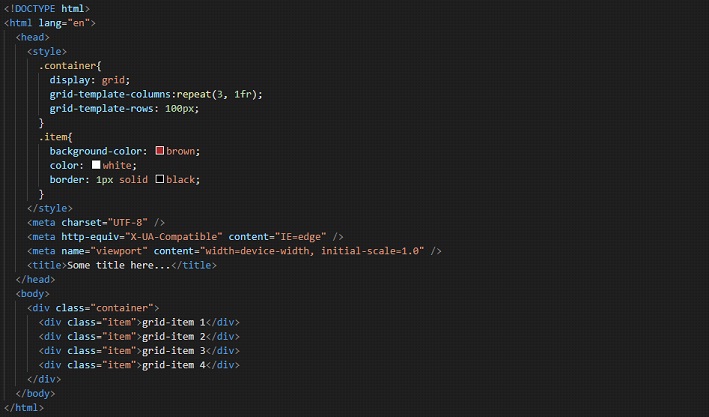
In the above code, we have specified for the first row, that it should be 100px. We have not done it for the second row, so it is going to be according to the content it has. Now, if we try to open the file in the browser, this is how it looks like –
 We have another property, which is grid-auto-rows, with which, we are going to specify the size of implicitly created rows. This is like, if we are not specifying the size differently for some row, this is what the size would be. Let’s have a look at this now –
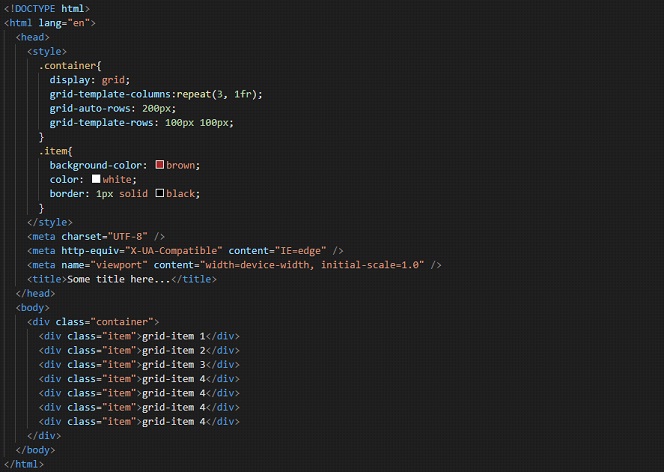
Well, now we have 7 grid items over here, and we have declared 3 columns, so, there would be 3 rows forming. For two rows, we have declared that they are going to have a size of 100 px 100px. But for the third row, we haven’t really specified anything here. But we have the grid-auto-row property set this time. So, for the row that we haven’t declared any size yet, it would be whatever there is in the grid-auto-row property. So, the third row is going to be of size 200px as specified. Have a look at the output –
Now, let’s say that you do not want to remember the numbers(sizes). You can just give them a name here. We are going to use the properties like grid-area and grid-template-area to do this.
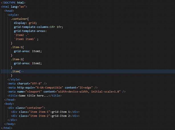
So, as you can see that I have added some classes, just to get some help. With the property grid area, we are specifying a name for the grid item. Also, it is a shorthand property for the properties like grid-row-start, grid-column-start, grid-row-end, and grid-column-end, which we are going to see further.
With the property grid-template-areas, we are referencing the named grid items over here. We can simply say that we are defining different areas with the apostrophe, within which, we have the named grid items as we want. If you want to refer to the grid item with no name, you can use the period(dot) sign. In our case, the dot came out to be an empty space, since we have all the named grid items. Try adding one more grid item to the container, and don’t give it a name. You will find that it is placed where you have given the period.
This is like visualizing the layout. In the first area, we are having item2 first, and then a grid item with no name, and then in the second area, we are having item1 spanning the 2 available columns. This is pretty easy to visualize. If you want to use it, you can do this.
Now, let’s have a look at some more properties over here –
Now, if we are willing to span the grid item to more than one column, we can make use of the property grid-column-start, and grid-column-end, with which, we are going to specify the start position and end position of the grid item in the grid placement.
So, with the grid-column-start property, we are specifying on which column line, is the item going to start. Again, with the grid-column-end property, we are specifying on which column line, is the item going to end.
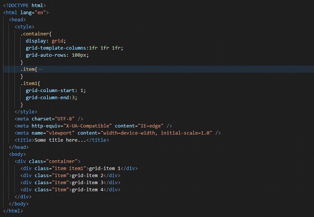
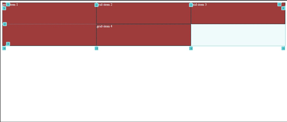
Have a look at the output –
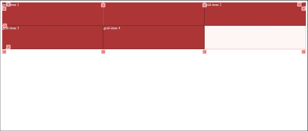
For better visualization, I have turned on the developer tools. So, here we can see the grid lines as 1, 2, 3, and so on. These are the grid lines, which we are going to use here. So, I have said in the property that my item1 should start from the grid line 1, and end at the gridline 3. So, if you try to visualize the same thing, the item1 is started at column line 1 and ends at column line 3.
We also got a shorthand property for this. We can just make use of the grid-column property. With this, we are going to specify both the start and the end here. Have a look at the below example-
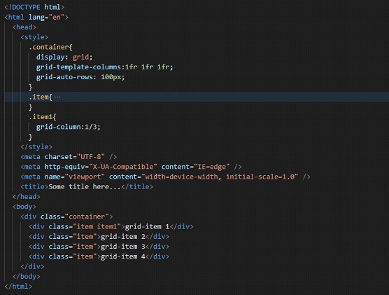
As you can see, using the shorthand property, we could specify the start and end of the column line for the given grid item. Earlier, we had to use two properties separately. Notice that we are doing this on the grid item, and not on the container.
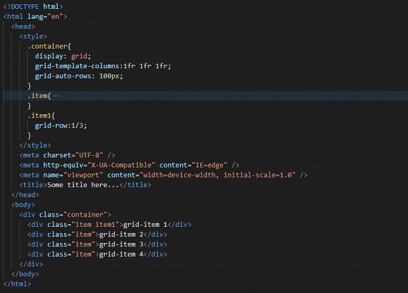
Similarly, we can span our grid item over multiple rows as well, using the other two properties, like the grid-row-start and the grid-row-end. So, here is an example of how are we going to use this –
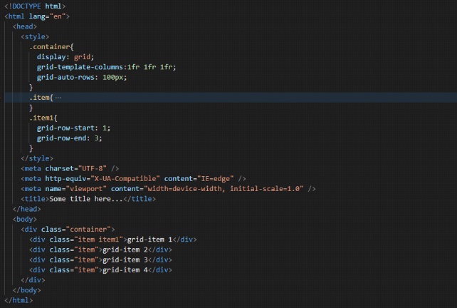
Now, again, we have these properties written for a grid item, and not the container. So, we are specifying that the grid item 1 should start at row line 1, and end at row line 3. So, if we try to open the file in the browser, this is the output –
If I remove the grid lines, we can see that the output is something like this –
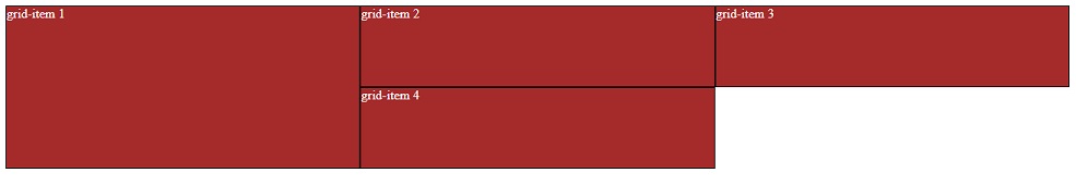
So, the grid item 1 starts at row line 1 and ends at row line 3.
We also have a shorthand property for the same. Let’s have a look at it. The property is grid-row.
This file is again going to give the same output as above. But we understood the shorthand property.
Now, we have seen much about the grid layout. But now, there is a small problem, that the items are appearing to be very compact here. It would have been good if there was some gap between them. So, now, we are going to add some gaps between them.
So, first of all, let’s have a look at the row-gap property, with which, we are setting the gap between the element’s grid rows. With the property row-gap, we are able to give the gap between the rows.
Have a look at the given code.
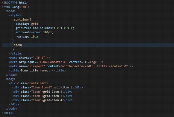
So, if we try to open the file in the browser, we find a 10px gap between the rows. Have a look at the output –
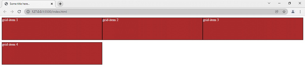
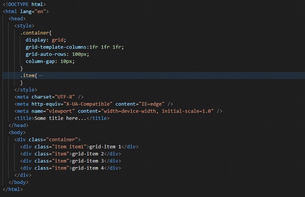
Now, if you want a gap between columns, you can just make use of the column-gap property, with which, we are specifying the gap between grid columns. Have a look at the below example –
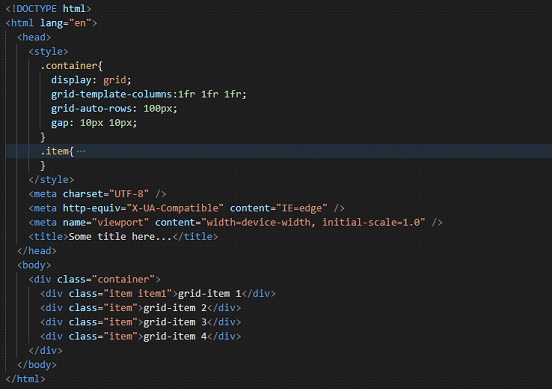
So, this time, we are able to see some gaps between the grid columns, with the help of the column-gap property. If you want to use them together, you can use them, or instead, we can make use of the shorthand property gap.
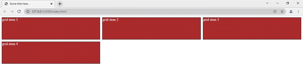
With this gap property, we can specify both the row gap and the column gap. First, we specify the row gap, and then the column gap. Have a look at the below example –
So, as an output, we can see something like this –
So, this is how we are working with grids. Whenever you want to work with some complicated layouts, you can make use of the grid layout.