CSS Gradient
Well, the gradient is a special type of image, which is made of a transition between two or more colors. We can choose different types of gradients, like linear gradient, radial-gradient, and conical gradients.
There are different functions that we are going to use in order to create the respective gradients. We can make use of the gradients, wherever we would want to make use of an image.
So, here are some types of gradients that we are going to have a look on –
- Linear Gradient → – defined by their direction(up/down/right/left)
- Radial Gradient → radiate from a central point. We can make the radial gradient circular or elliptical.
- Conic gradient → this type of gradient rotates around the center(this is different from the radial gradient. We will see how)
First of all, let’s have a discussion about the linear gradient –
The linear gradient is the most basic type of gradient. We are just creating a band of colors, that would progress in a straight line. We are going to make use of the function linear-gradient() to achieve this.
The linear gradient is a function, with which, we are going to create an image consisting of a progressive transition between two or more colors along a straight line.
To create a gradient, you must give at least two colors, and you can also set the direction of the gradient. Now let’s talk about how can we create a linear gradient.
linear-gradient(direction , color1 , color2 …);
The default direction that is followed by the gradient is from top to bottom.
You can change this by specifying the direction (to right, to left, to bottom right, etc) or specify it with a certain angle.
You can refer to the below code to understand the gradients in a better way –
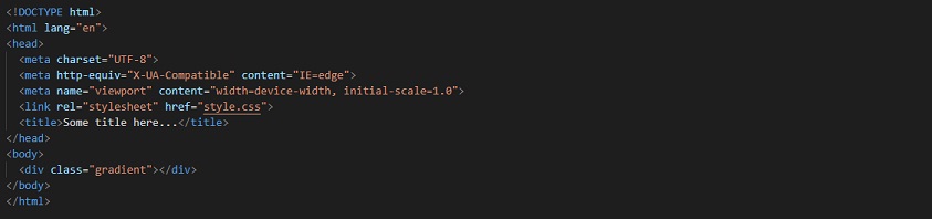
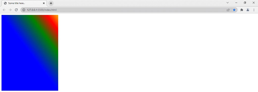
So, simply we are giving a gradient to the div, with the class gradient, instead of the background color. Here is the output –
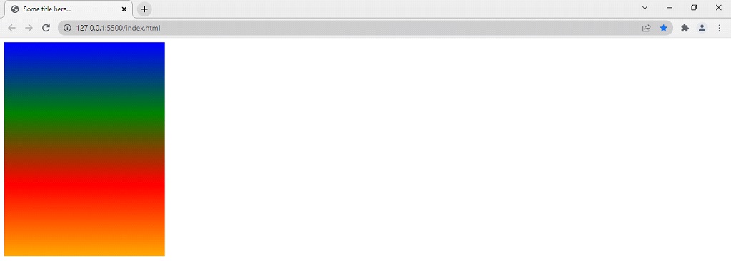
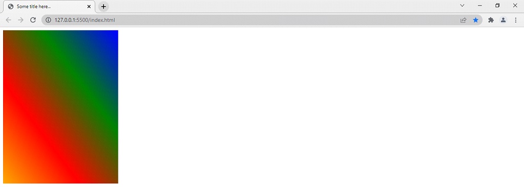
As you can see, the gradient by default progresses from top to bottom. But if you want to change the direction of the gradient, it is possible. Here is how we can do that –

So, we can also change the direction of the colors. The default direction of the gradient is from top to bottom. As you can see that in the above example, we have specified the direction of the gradient to the bottom left, due to this, the output is as shown below. You can also try some other values, like to right, to left, to top, to bottom right, and so on, or you can also try removing the direction, so as to check what is the default behavior. This is how the same gradient would look if we have specified the direction to the bottom left.
You can try putting more colors and changing the directions. It’s fun.
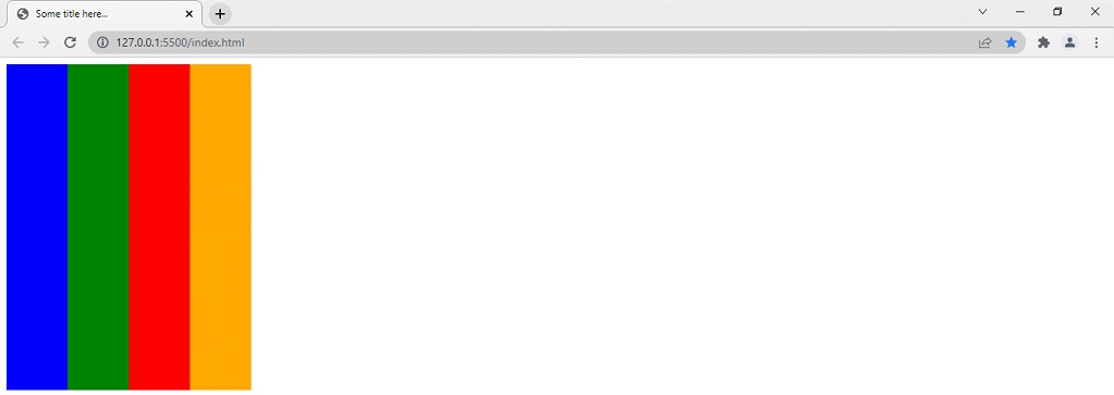
Also, if you want to specify the color stops, you can declare them too. Let’s now see, how are we going to do it.
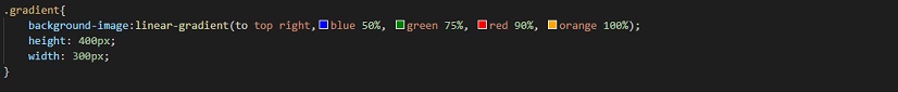
The other things are the same, just we have added the color stops now. We are specifying that the blue color should go up to 50%, then the green up to 75%, then the red color up to 90%, and orange to 100%. This is what it would look like –
Well, now you can see, that the color stops that you have specified, are being now followed. If you do not specify the color stops for some colors, they are automatically calculated.
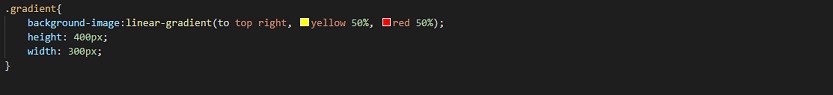
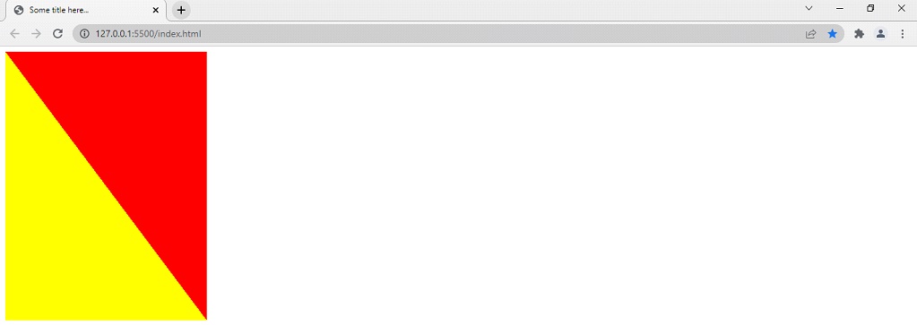
You might have observed that the transition from one color to another color, is pretty smooth, but if you wish to have a fine line between the transition, you can do that too. We are again going to take help from the color stops. Here is how we are doing this –

If we are doing something like the above, the output comes out to be something like this –
You can do something like this as well –
Here, the color stop at 50% is being shared halfway through the gradient. Due to this, the output comes out to be something like this –
Well, till now, we were dealing with the linear gradient, which is a transition from one color, to another color, along a straight line. But now, we are going to look after another type of gradient, which is the radial gradient. We will be using the radial-gradient function, with which, we are going to create a progressive transition, from one color to another color, radiating from an origin(as discussed earlier, the radial gradient radiates through a central point). We can specify the shape like a circle or elliptical.
Below given is the demonstration of how we are going to apply the radial gradient. It is quite similar to the linear gradient though.
background-image: radial-gradient(shape , color1 , color2 , color3 , …. )
Here, we are again forming the gradient, but this time it would be radial. So, we are going to need minimum two colors to do so. Lets have an example so that we can understand the radial gradient –
<!DOCTYPE html>
<html lang=”en”>
<head>
<style>
.gradient
background-image: radial-gradient(red, blue, lightgreen, orange); height: 200px;
width: 300px;
}
</style>
<meta charset=”UTF-8″>
<meta http-equiv=”X-UA-Compatible” content=”IE=edge”>
<meta name=”viewport” content=”width=device-width, initial-scale=1.0″>
<title>Understanding Gradient</title>
</head>
<body>
<div class=”gradient”></div>
</body>< </html>
Well, the output of the above code comes out to be something like this –
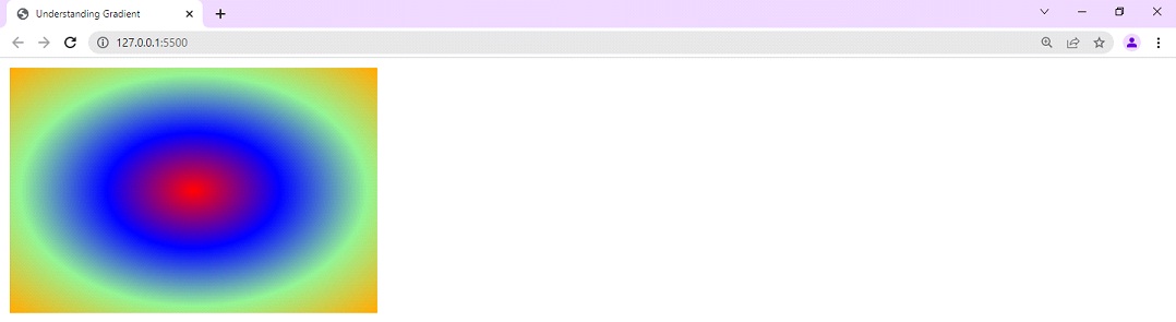
As you can see, the gradient radiates through the center. By default, the center is specified as 50% 50%. However, you can change this too. Even you can change the shape as well. Let’s now try these things as well.
First of all, lets look after the shape of the gradient. By default, you can see that the shape of the gradient comes out to be ellipse. If we want, it can be circle as well. Have a look at the below program, where, we are just making a slight change, by mentioning the shape as circle.
<!DOCTYPE html>
<html lang=”en”>
<head>
<style>
.gradient {
background-image: radial-gradient(circle, red, blue, lightgreen, orange);
height: 200px;
width: 300px;
}
</style>
<meta charset=”UTF-8″>
<meta http-equiv=”X-UA-Compatible” content=”IE=edge”>
<meta name=”viewport” content=”width=device-width, initial-scale=1.0″>
<title>Understanding Gradient</title>
</head>
<body>
<div class=”gradient”></div>
</body>
</html>
Now, lets have a look at the output –
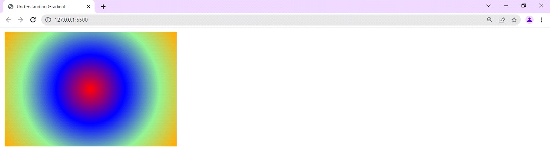
As you can see, the shape of the gradient has now become a circle, as specified. Also, if you want to have fine lines over here, you can have them too. Have a look at the below example, to understand how we have did this –
<!DOCTYPE html>
<html lang=”en”>
<head>
<style>
.gradient { background-image: radial-gradient(circle, red 25%, blue 25% 50%, lightgreen 50% 75%, orange 75% );
height: 200px;
width: 300px;
}
</style>
<meta charset=”UTF-8″>
<meta http-equiv=”X-UA-Compatible” content=”IE=edge”>
<meta name=”viewport” content=”width=device-width, initial-scale=1.0″>
<title>Understanding Gradient</title>
</head>
<body>
<div class=”gradient”></div>
</body>
</html>
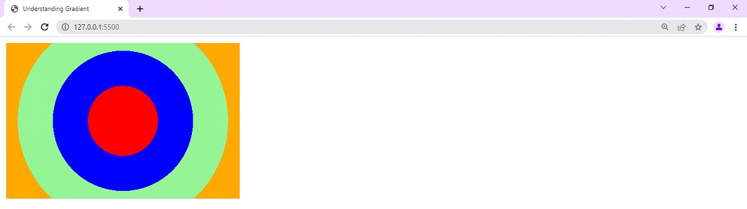
Now, if you try to have a look at the output, you can find that there are fine lines. Have a look at the output –
Now, when we know that the shape of the gradient can be specified, let’s have a look at how can we specify the center of the gradient. By default, it is 50% 50%. Have a look at the below example, where we are trying to change the centre of the gradient. This is how we do it –
<!DOCTYPE html>
<html lang=”en”>
<head>
<style>
.gradient {
background-image: radial-gradient(at 0% 50%, red, blue, lightgreen, orange );
height: 200px;
width: 300px;
}
</style>
<meta charset=”UTF-8″>
<meta http-equiv=”X-UA-Compatible” content=”IE=edge”>
<meta name=”viewport” content=”width=device-width, initial-scale=1.0″>
<title>Understanding Gradient</title>
</head>
<body>
<div class=”gradient”></div>
</body>
</html>
As you can see, inside the radial-gradient function, we have specified the new centre of our gradient, as 0% 50%. This is what it looks like –
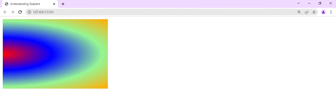
In this way, you can also specify the center of the gradient.
Now, lets move to the next type of gradient, which is the conic gradient.