CSS Flexbox
We have been dealing with the display property, and we have seen some values related to it, like block, inline, and inline-block. Now, we are going to head up to the concept of flexbox.
The flexible box module, or the flexbox, is something, with which, we can get the power to align the elements in the document. it deals with the layout, one dimension at a time, which means that either we are controlling the rows or the columns.
We are going to start with how can we create a flexbox. It is simple. It is just that we have to create a container and make its display flex. All the immediate children of it, now become the flex items. So, there are two terms over here, the flex container, and the flex items. The flex container is simply going to contain the flex items. There are certain properties that we can apply to the flex container, and some can be applied to the flex items. We are going to go through many properties one by one.
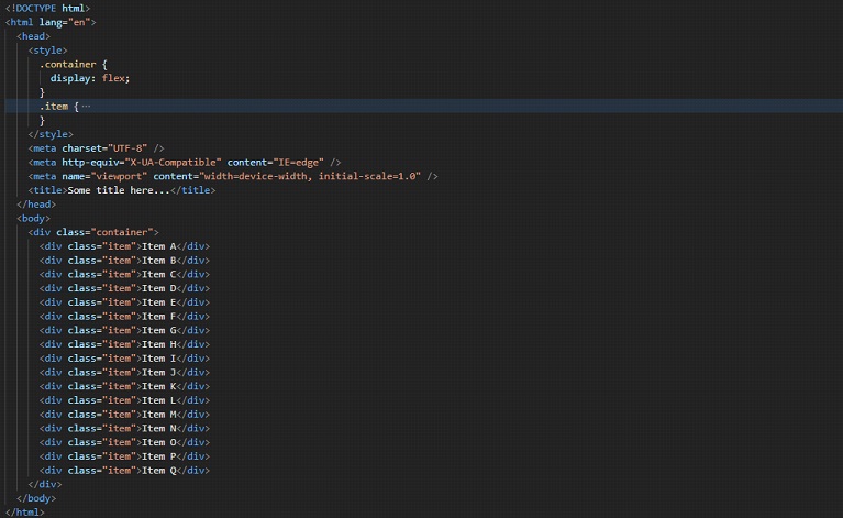
Now, let’s see how are we going to create a flexbox. It is so simple. Just create a container(anything), and make its display flex. All the direct children of the container are going to be the flex items. Basically, in the below code, we have created a div, which belongs to a class container(you can give some another name as well). Inside the div, we have some other divs, which belong to the class item(the same applies to this).
Now, we have declared the display of the container to be flexible. With this, all the direct children of the container have now become flex items. We also have applied some properties to the items. These are just some general properties that we are already familiar with. Have a look at the code –
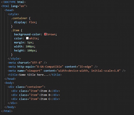
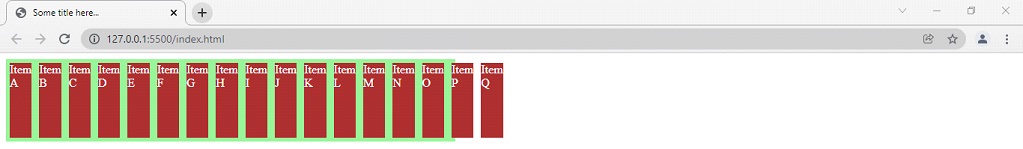
If we try to open the file in the browser, the output is something like this –
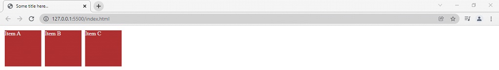
As you can see, the items are now flexed items. There are many properties that we are going to look at ahead, but here, you can see that all the flex items have appeared on one single row. So, since the container is now flexbox, there are other properties that are coming into action, with their default values initially. Basically, there are going to be some properties relating to the flex container, and some other properties relating to the flex items.
Here are some properties relating to the flex container –
- flex-direction
- flex-wrap
- flex-flow
- justify-content
- align-items
- align-content
Also, when we are working with the flexbox, we have to think with respect to two axes, which are the main axis and the cross axis. The main axis is defined by the flex-direction property, and the cross axis is perpendicular to it. We are going to do a lot of things with flexbox, and we will find that we are going to be working around these axes here.
Now, let’s talk about flex-direction property. With this, we are going to determine the direction of flexbox items. So, here are some values that we have for this property –
- row
- row-reverse
- column
- column-reverse
The default value for the property is row, which is a reason why all the flex items came into one row, as soon as we declared the container as a flexbox. As you might have guessed for the other values as well, let’s try doing column now, which would set all the flex items column-wise. Remember that this is a method for flex containers, and not flex items.
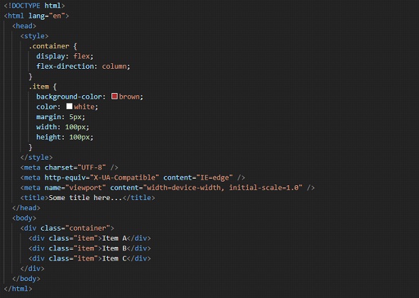
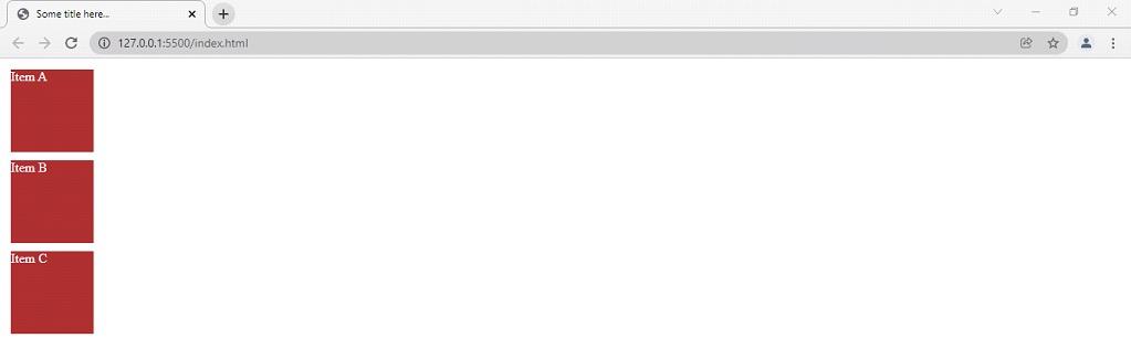
So, as an output, we can see that all the flex items now are arranged in columns, which were previously arranged in rows. Have a look at the output, and observe that we have given the flex-direction property for the container, and not items.
You can also try putting the values like row-reverse, and column-reverse. For these above-discussed values, these are going to be reversed of them.
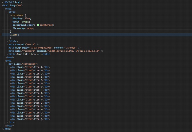
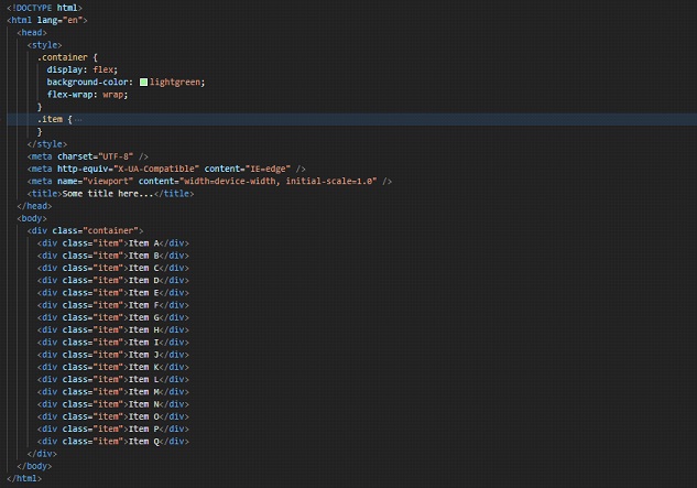
So, now we are going to see our next property, which is again related to the flex container, which is flex-wrap. By default, the value for this property is going to be no-wrap. With this property, we are specifying whether should the flex items wrap or not. i.e, should they be forced to be on one line, or wrap into multiple lines. Let’s have a look at what would happen if we have kept the default value for the flex-wrap property –
As you can see, we have now got a lot of items here. Let’s say that we have a limited width container, of 600px(you can add the width property to the container). You can find that the items are overflowing from the container now since, by default, they are forced to be on one line. But, by changing the value to wrap, we can fix this. First, have a look at the output that we have with the above code –
As you can see, we have added a simple background color to the container, so that we can visualize the container and the overflowing flex items. As we can clearly observe, the flex items are overflowing. So, we can set the value of the flex-wrap property to wrap, and just observe the changes. Remember that this property is also for the flex container and not the items. So, remember to write it for the container. Let’s have a look at the code and output as well –
Let’s have a look at the output –
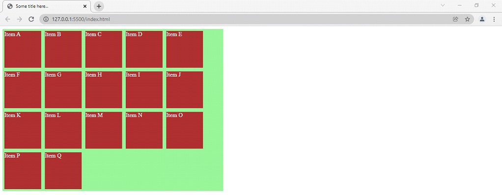
Now, you can see that the flex items are not forced to be on one line, instead, they are now on multiple lines. Also, let’s change the example a little bit now. When we are saying wrap, we are saying that ok… if you do not have space to be on this line, just go to the new line. This also brings some sort of responsiveness here. Have a look at the below example to understand this –
There is only one change made, I have removed the width of the container that we had set earlier. Now, try to resize the browser window, and you will find that the flex items are on multiple lines. It is like if the item has got enough place to be on that line, it will be on that line. Else, it is going to a new line.
There is another value here as well, which is wrap-reverse. You can try using this value, and observe what happens.
Now, we move to our next property, which is flex-flow. This property is a shorthand property for flex-direction and flex-wrap properties, which we are already familiar with.
Let’s quite modify our above example, to understand the flex-flow property.
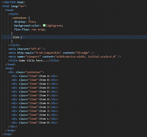
So, as you can see, now the flex-direction is set to row, and the wrapping behavior is set to wrap. You can try opening this file in the browser to have the output. Since we are familiar with those two properties, this property should be pretty easy for us now.
Now, we are going to move to some properties, which would be of quite frequent use, when we will be dealing with flexbox. These properties that we are now going to see are subject to alignment – horizontal and vertical. The properties are justify-content and aligned items.
The justify-content property is going to look for the alignment of items along the main axis, and the align-items property is going to look for the alignment of items along the cross axis.
As we know, by default, the flex-direction is a row, so the main axis will be along the row, and the cross axis would be perpendicular to it.
So, by default, the justify-content thing is going to look for the horizontal alignment, and the align-items are going to look for vertical alignment. (provided that the flex-direction is set to row).
Let’s have a look at both the properties, the align-items, and justify-content.
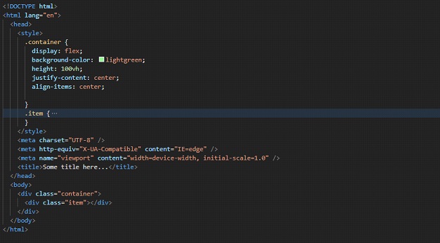
Using the above code, we have just centered the flex item of the container. Well, if we just remove the align-items property, the flex item is going to be horizontally centered. Same thing you can try with the align-items property, just to observe what is going on. We could center the element horizontally and vertically, so, this is one of the comfortable ways that we can use to center the elements as required. If you are wondering about why did I put height as 100vh there? Well, I just changed the height of the container, so that I can demonstrate about centering vertically and horizontally as well.
There are some other values as well, for these properties. Here are some of the values that you can try for these properties, and you can use them as per your convenience.
Some values for justify-content →
- space-between
- space-around
- space-evenly
lets see what happens when we apply space-between as a value for justify-content property –
As you can see, the elements have even spaces between them. I have used developer tools for better visualization.
Now, let’s have a look at the next value, which is space-around →
As you can see, there is now some space around the flex items.
Have a look at the next value, which is space-evenly →

You can clearly see the difference between space-around and space-evenly. In the space-around, the space between the elements is going to be equal, but the space from the start and end is going to behalf. Whereas, when we are doing space-evenly, the space between the elements, and the space at the start and the end is also equal.
Now, let’s have look at some values related to the align-items property →
- center(we know about this…)
- flex-start
- flex-end
If we set the value to flex-start, as the name says, the items are now positioned at the start of the container. Have a look at how it looks, if we have set the align-items property to flex-start(note that the justify-content is set to center for now…) –
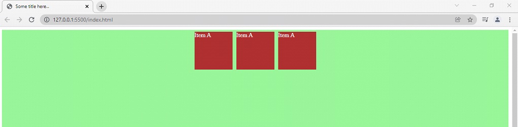
As you can see, the items are at the start of the container(vertically)…
Now, let’s have a look at the next value, which is flex-end. The name only says that the items are now going to be at the end of the container. Let’s have a look at the output –
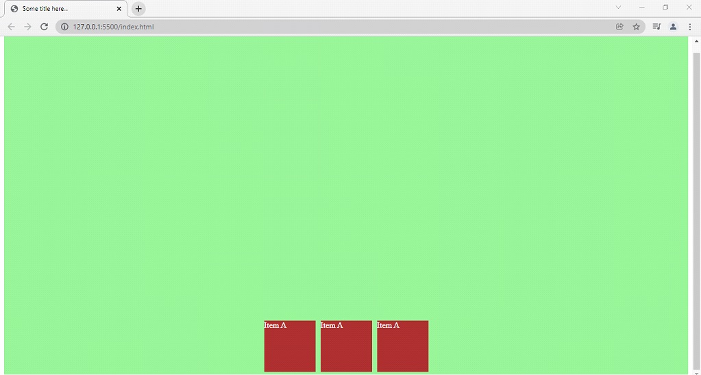
As you can see, the items are now set at the end of the container. You can use these properties as per your requirement. Remember the way we used these properties to center the element vertically, as well as horizontally. If you need to center some element, it is a way that you would want to use(there are some other ways too).
Now, let’s have a look at some properties related to the flex items. These include –
order
- flex-grow
- flex-shrink
- flex-basis
- align-self
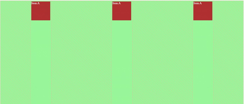
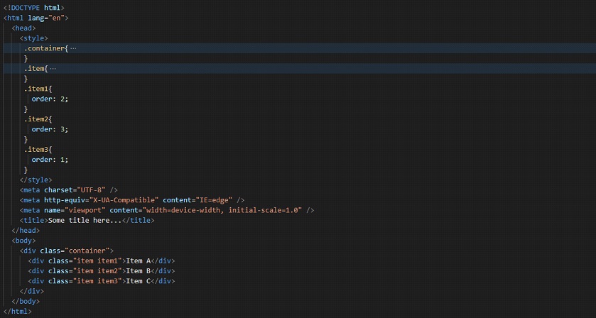
order → With this property, we are going to specify the order of the particular flex item with respect to other flex items in the same container. By default, the value of this property is zero, but we can decide the order as well.
Here is how we do it →
If we try to have a look at the output now, it looks something like this –
As you can see, the order of the flex items in the flex container has been changed now. So, if you need to adjust the order of the flex items in the flex container, you can make use of the order property for the flex items.
Now, let’s move on to another property related to flex items, which is flex-grow.
With this property, we are specifying how much the flex item will grow relative to the other flex items in the same container. We have to specify the flex-grow factor, as a number. Lets now have a look at the example below –
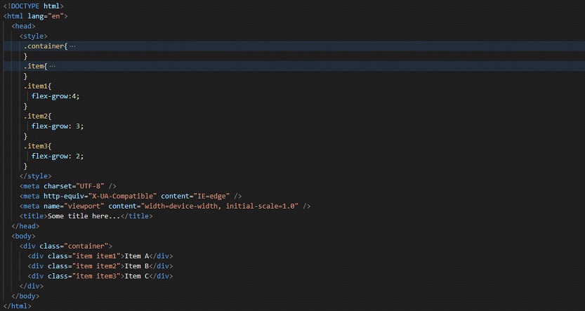
Now, if you try to have a look at the output, and resize the window, you will find that the flex items are growing at the different specified rates. Try resizing the window, and you will find the difference.
Just like there is flex-grow, there is also flex-shrink. With this property, we are specifying how will the flex item shrink relative to the other flex items in the same container. Note that, for the above example, I have changed the width of the item to 400px. Lets now have a look at the below example –
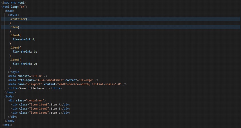
Now, you can try following along, and try opening the file into the browser, and seeing the effect of the flex-shrink property. You can try putting different values on the property. Putting a value of zero for the flex-shrink property will make that particular item not shrink. You can try doing this too. Put some element’s flex-shrink value to 0, and then try resizing the window, to observe the shrink thing.
Note: Add the note into the Video, that zero value for flex-shrink property results in no-shrink of that element.
Now, let’s have a look at the next property related to the flex items, which is flex-basis. Well, with this property, we are going to specify the initial main size of the flex item. Have a look at the below example, where we are trying to use the flex-basis property on some flex items.
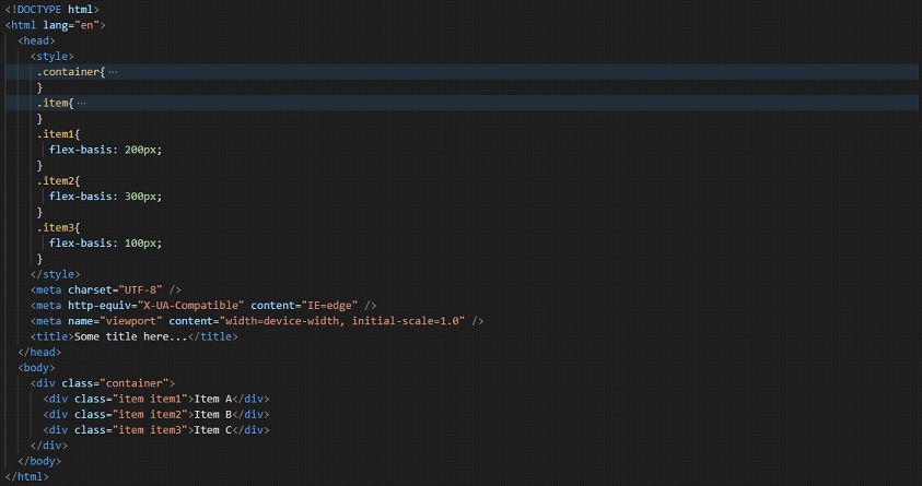
You can follow along, try opening the file into the browser, and observe the changes.