CSS Filter Property
Whenever we click pictures on our mobile phones, we can put some filters onto the images, as the visual effects, for doing things like making the image black and white, increasing or decreasing the brightness, and contrast, or making the image blur, and some more things. Similar to this, we can do these things here as well, on some element (usually an image).
Here, using the filter property, we can put some different visual effects on the element (usually an image)
So, now let’s have a look at some different visual effects that we can have here –
- blur() → With this function, we can make the element(usually an image) blur by a given pixel amount.
- contrast() → With this function, we can adjust the contrast of the image.
- brightness() → As the name says, this function helps us adjust the brightness of the image.
- grayscale() → The function helps us to convert the image to grayscale.
- opacity() → This function helps us set the opacity level for the element(usually an image)
- saturate() → This function helps us saturate the image.
And some other visual effects are there as well.
As you can see, we have some different images, belonging to different classes, which contain filters, like a blur, contrast, saturation, etc. These classes are applied to the different images(basically, it is the same image every time! lol). But, we get to see the different filters over the images. Have a look at the output of the program –
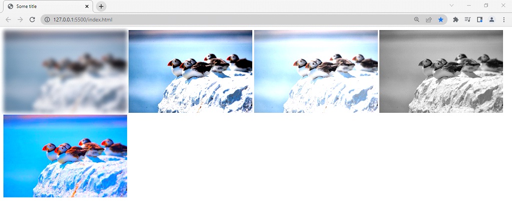
As you can see, the different filters are applied to the images. You can also try these different filters, and use them as per your requirement.