CSS Background Clip
With this property, we are determining whether the background of an element extends underneath its border-box, padding-box, or content-box. Let’s now try playing with this property.
The values that we have got for the property are border-box (which is the default), padding-box (which means that the background of the element extends underneath the padding box), content-box(which means that the background of the element) extends underneath the content-box, and there is another value as text, where the background appears to be clipped to the foreground text.
If you are confused between what is border-box, padding-box, etc, just remember the box model thing.
There, we have some content, and the padding is the space around the content, inside the border, and then comes the border, and then outside the border, there comes the margin thing.
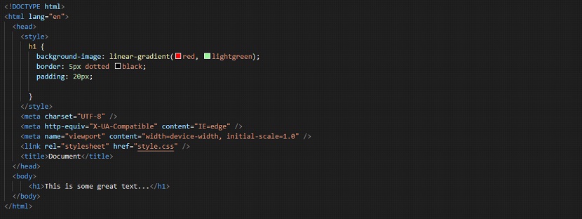
So, when we are declaring nothing about the background-clip property, it has the default value, which is the border-box. Now, have a look at the below example, to get an idea of this property –

If we have a look at the output, it appears to be something like this –

As you can see, when we are not specifying anything, the value for the background-clip property is border-box. So, you can see that the background extends underneath the border as well.
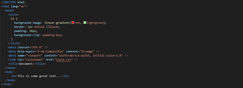
Now, if we set the background-clip property to padding-box instead, then you will observe that the background of the element extends underneath the padding-box, and it is not underneath the border now. Have a look at the below example, where we have made just one change.
Remember that we had earlier set some padding for the element, so as to clearly visualize everything.


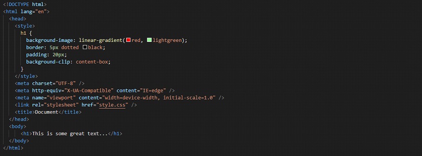
As you can see in the output, the background of the element is only extended underneath the padding box. Now, if we try putting another value, which is content-box, then have a look at what this thing looks like. Have a look at the below example –

Have a look at the output →

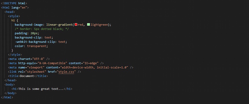
As you can see, the background is now extended underneath the content box. Now, we are going to see the next value, which is text. When we set the property value to text, the background of the element is clipped to the foreground text. Let’s now have a look at what happens when you do it.

If you carefully observe the properties that we have applied, you can see that we have a background image, and some padding, and we are using the background-clip property, also one with a WebKit vendor prefix.
We also have specified the color property with a value of transparency. If the WebKit thing is missing from your code, and you are viewing the file in chrome, you would see some output that is not usual. If you are using Mozilla Firefox, you can see the output as we have.

As you can see, the background of the element appears to be painted to the foreground text. So, this way, you can make use of the background-clip property.


